सही लिविंग रूम के लिए सर्वश्रेष्ठ टाइल कलर हर घर के मालिक की प्राथमिकता होनी चाहिए, क्योंकि यह सजावट को परिभाषित करने से कहीं अधिक करता है. यह टोन सेट करने में मदद करता है कि स्पेस कैसे महसूस करता है. प्रोफेशनल डिज़ाइनर हमेशा टाइल शेड को अंतिम रूप देने से पहले तीन पहलुओं पर विचार करते हैं: लाइट, मूड और रूम साइज़.
इन तीनों तत्वों में से प्रत्येक एक शेड कैसे दिखाई देता है, इसे कैसे देखा जाता है, और यह स्पेस को कैसे प्रभावित करता है. अगर आप अपने लिविंग रूम को रिनोवेट करने या इसे एक नया टच-अप देने की योजना बना रहे हैं, तो बस सही रंग का इंस्टॉल करें टाइल्स महत्वपूर्ण दृश्य सुधार ला सकता है.
प्रोसेस वाले लोगों की मदद करने के लिए, हमने सबसे अच्छी लिस्ट दी है लिविंग रूम के लिए टाइल कलर लाइटिंग, मूड की पसंद और साइज़ के आधार पर. इसलिए, टॉप टाइल रंगों के बारे में जानने के लिए पूरा ब्लॉग पढ़ें.
लिविंग रूम एम्बिएंस पर टाइल कलर के प्रभाव को समझना
कॉम्पैक्ट लिविंग रूम- टाइल कलर सीधे कमरे के चरित्र को आकार देते हैं. इसलिए, आप डिजाइनर को रणनीतिक रूप से कॉम्पैक्ट लिविंग रूम के लिए लाइट बेज या सॉफ्ट ग्रे जैसे लाइट-रिफ्लेक्टिव टोन चुन सकते हैं, क्योंकि वे अधिकतम ब्राइटनेस को बढ़ाते हैं, जिससे स्पेस अपने वास्तविक साइज़ से थोड़ा बड़ा दिखता है..
आप जोड़ सकते हैंऑर्नेट वाइन टस्कन वॉलपेपर बेज फ्लोर टाइल्स के साथ एक सूक्ष्म सीशेल डिज़ाइन की विशेषता पेल लिनेन ब्रेशिया कार्विंग. यह पेयरिंग एक गर्म, शानदार स्टाइल बनाए रखते हुए दृश्य रूप से स्पेस का विस्तार करता है.
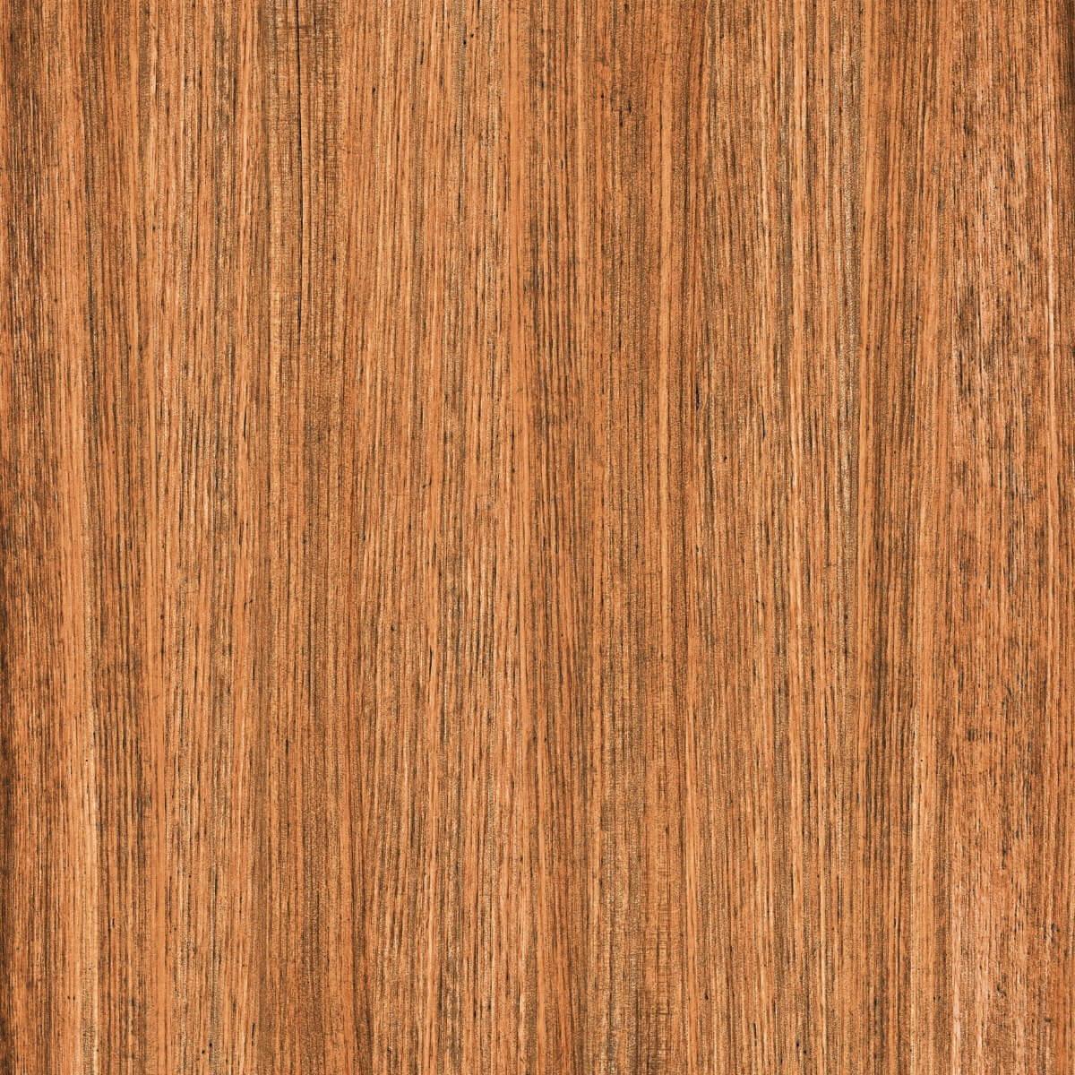
विशाल लिविंग रूम-जब विशाल लिविंग रूम की बात आती है, तो वे आमतौर पर चारकोल या वॉलनट रंगों जैसे डार्कर टोन पर चिपक जाते हैं, क्योंकि ये शेड्स गर्मजोशी के साथ ग्राउंड स्पेस में मदद करते हैं..
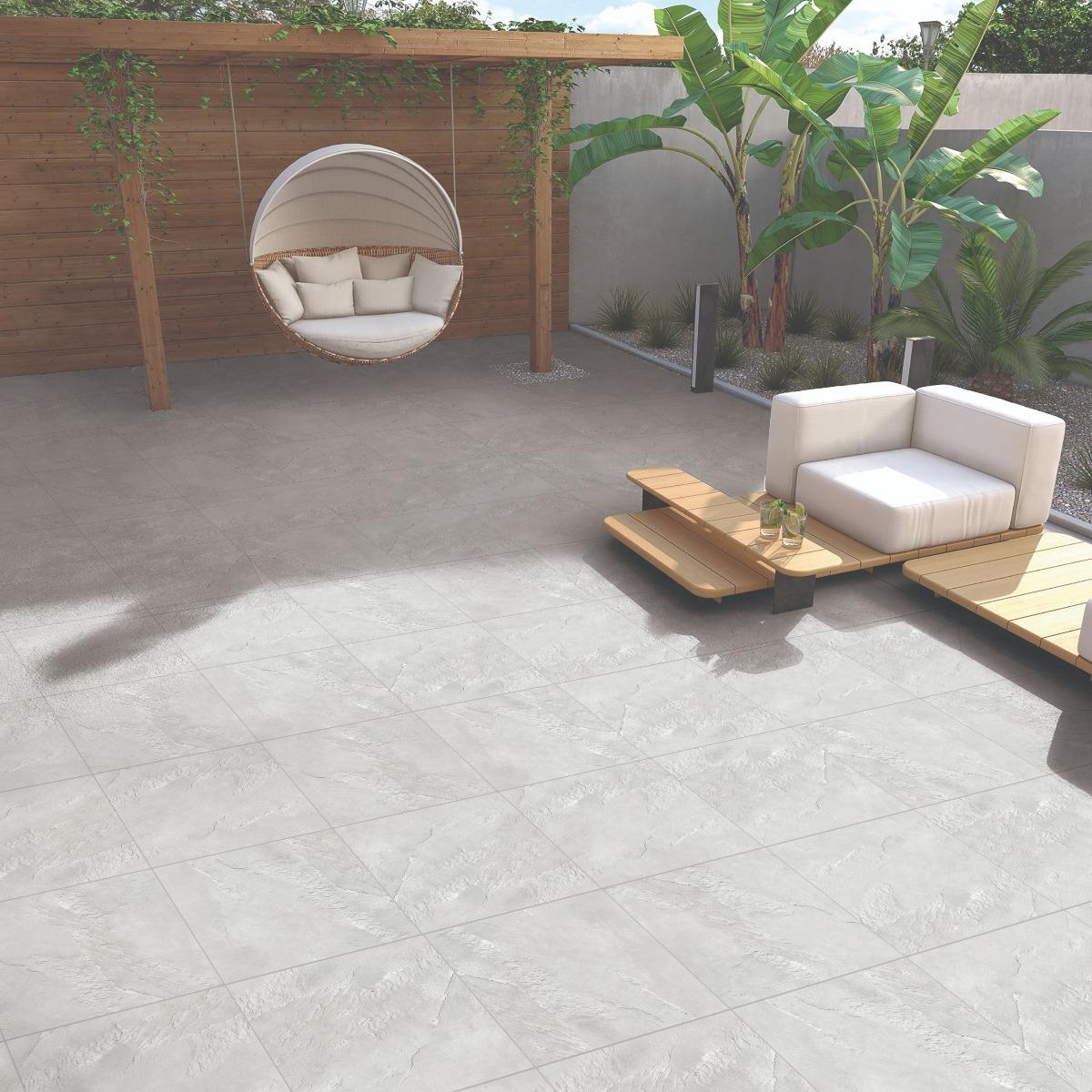
ऊपर के वातावरण में, डॉ DGVT सैंडस्टोन ग्रे लिमिटेड वॉल टाइल इसके साथ जोड़ी गई है DGVT सैंडस्टोन ग्रे DKफ्लोर टाइल, इस बैलेंस को खूबसूरती से दिखाती है- खुलेपन और विशालता की भावना को बनाए रखते हुए एक ग्राउंडेड, एलिगेंट लुक बनाती है.
सही फिनिश चुनना
टाइल की फिनिश चॉइस इस प्रभाव को बढ़ाती है.
ग्लॉसी टाइल्सरिफ्लेक्शन को बढ़ाएं, जो उन्हें आधुनिक और हवाई सेटअप के लिए आदर्श बनाते हैं..
मैट फिनिश टाइल्सऐसी जगहों के लिए आरक्षित हैं जिनके लिए आरामदायक, घरेलू महसूस की आवश्यकता होती है..
चुनने का एक व्यावहारिक तरीका लिविंग रूम के लिए बेस्ट टाइल कलर यह मूल्यांकन करने के लिए है कि आपकी शॉर्टलिस्ट की गई शेड विभिन्न लाइटिंग स्थितियों में कैसे दिखाई देती है. अगर आपके लिविंग रूम को पूरे दिन पर्याप्त धूप मिलती है, तो यह हल्के ग्रे या स्टोन व्हाइट जैसे कूलर टोन से लाभ उठा सकता है, जो ब्राइटनेस को बैलेंस करता है और ग्लेयर को रोकने में मदद करता है.
हालांकि, अगर आपके लिविंग रूम को सीमित प्राकृतिक डेलाइट मिलती है, तो वे आइवरी या लाइट बेज जैसे गर्म अंडरटोन के साथ जीवित हो सकते हैं. ये शेड्स प्रकाश को बाउंस करते हैं, जो पूरे स्पेस में एक जेंटल ग्लो जोड़ते हैं.
प्रोफेशनल डिज़ाइनर आदर्श रूप से प्राकृतिक और आर्टिफिशियल लाइट दोनों के तहत टाइल सैंपल देखते हैं, ताकि फाइनल टाइल शेड वास्तव में घर की लाइटिंग कंडीशन को पूरा करता है. सुनिश्चित करें कि आप ऐसा करें.
टाइल के रंग कमरे के आकार की धारणा को प्रभावित करते हैं
रंग दृष्टिगत रूप से बदल सकते हैं कि स्पेस में कितना बड़ा या छोटा महसूस होता है. इसलिए, आपको साइज़ के मामले में अपना स्पेस कैसे दिखना चाहते हैं, इस आधार पर रंग चुनना चाहिए. कॉम्पैक्ट लिविंग रूम या अपार्टमेंट वाले लोग ऑफ-व्हाइट, सैंड या मिस्टी ग्रे जैसे पेल टोन चुन सकते हैं, क्योंकि वे हल्के समान रूप से दिखाते हैं, जिससे अधिक स्पेस का भ्रम पैदा होता है.
हालांकि, अधिक खुले, बड़े लिविंग रूम लेआउट वाले लोगों को कॉफी ब्राउन या ग्रेफाइट ग्रे जैसे रिचर शेड्स की ओर झुकना चाहिए ताकि एकजुटता और आराम की भावना लाई जा सके. अगर आपके घर में मिड-साइज़ लिविंग रूम है, तो बिना डार्कनिंग रूम के गहराई जोड़ने के लिए टॉप या वॉर्म टोन जैसे संतुलित न्यूट्रल के बारे में जानें.
अगर आप खोज रहे हैं लिविंग रूम में बेस्ट टाइल्स कलर, फिर आपको रंग मनोविज्ञान की अवधारणा देखनी चाहिए. यह अवधारणा इस बात को दर्शाती है कि हर रंग एक अलग भावना पैदा करता है. इसलिए, लोगों को वातावरण के आधार पर टाइल शेड चुनना चाहिए.
कलर टाइप
शेड्स
प्रेरित
प्रभाव/महसूस
गर्म रंग
लाल, ऑरेंज, पीला
धूप, आग और गर्मजोशी
ऊर्जा, आराम और स्वागतमय परिवेश को विकसित करें
कूल कलर्स
ब्लू, पर्पल, ग्रीन
पानी, आकाश और घास
शांतता, आराम और एक ताज़ा माहौल बनाएं
आप अपने स्पेस में शांतता और स्पष्टता को बढ़ावा देने के लिए सफेद और सॉफ्ट क्रीम चुन सकते हैं. ये शेड्स न्यूनतम या तटीय-प्रेरित इंटीरियर वाले स्पेस के लिए आदर्श हैं. बेज और टैन फैमिली स्पेस के लिए बेहतरीन विकल्प हैं, क्योंकि वे गर्मजोशी लाते हैं और आराम को बढ़ाते हैं.
जो लोग अत्याधुनिकता की तलाश करते हैं, वे ठंडी अंडरटोन के साथ म्यूटेड ग्रे के साथ चिपके रह सकते हैं, क्योंकि वे बिना भारी सजावट के रिफाइनमेंट जोड़ते हैं. जो लोग अपने लिविंग रूम में अधिक आधारित, स्वागत की भावना चाहते हैं, उन्हें टेराकोटा और सैंडस्टोन जैसे अर्थी टोन चुनना चाहिए.
अगर आप वास्तु-अप्रूव्ड कलर के साथ अपने लिविंग रूम को सजाना चाहते हैं, तो इस क्विक वीडियो को देखें जो किसी भी भ्रम को दूर करना चाहिए.
निष्कर्ष
ब्राउज़ करते समय लिविंग रूम के लिए टाइल कलर, कई लोग निम्नलिखित ट्रेंड की गलती करते हैं. अगर आप चाहते हैं कि आपका लिविंग रूम व्यक्तिगत रूप से महसूस करे और दिखाए, तो आपको अपनी पसंद के अनुसार टाइल शेड चुनना चाहिए. आपके लिविंग रूम की लाइटिंग, मूड और रूम साइज़ के आधार पर शेड्स का मूल्यांकन भी किया जाना चाहिए.
सोच-समझकर चुने गए शेड एक सादा लिविंग रूम को एक चमकदार, विशाल और भावनात्मक रूप से संतुलित वातावरण में बदल सकता है. इसलिए, चाहे आप ग्रे, आरामदायक बेज या फ्रेश व्हाइट को शांत करने के लिए तैयार हों, अपने लिविंग रूम के लाइटिंग और उद्देश्य को पूरा करने के लिए अपनी पसंद को सुनिश्चित करें.
अगर आप विकल्पों से भयभीत महसूस करते हैं, तो ब्लॉग में चर्चा की गई शेड चुनने पर विचार करें. रंग अंतिम हो जाने के बाद, आप इसे यहां से प्राप्त कर सकते हैं ओरिएंटबेल टाइल्स. इसके अलावा कई प्रकार के लिविंग रूम टाइल्स, ब्रांड स्मार्ट खरीद निर्णयों की सुविधा के लिए ट्रायल लुक और विशेष टूल जैसे टाइल कैलकुलेटर भी प्रदान करता है.
प्रेरणा शर्मा में कंटेंट निर्माण और मार्केटिंग रणनीतियों में 12 वर्षों का व्यापक अनुभव है. पिछले दो वर्षों से उन्होंने ओरिएंटबेल टाइल्स में कंटेंट वेबसाइट एडिटर के रूप में कार्य किया है, जहां वह ऑनलाइन विवरणों को आकार देने में महत्वपूर्ण भूमिका निभाती है. प्रेरणा की विशेषज्ञता साइबरमीडिया, एचटी मीडिया और एनआईआईटी विश्वविद्यालय में प्रभावशाली भूमिकाओं के माध्यम से प्राप्त की गई है. उन्होंने एमिटी इंटरनेशनल बिज़नेस स्कूल से अंतर्राष्ट्रीय बिज़नेस में एमबीए और एशिया पैसिफिक इंस्टीट्यूट ऑफ मैनेजमेंट से बैचलर ऑफ बिज़नेस एडमिनिस्ट्रेशन में एमबीए किया है..


 600x1200 मिमी